Latest Works
Product and Responsive Website Design: Just Boardrooms
Art direction, UX/UI design, prototyping for The Turn Lab; client: Just Boardrooms
Just Boardrooms is a SaaS application that allows businesses to rent out their unoccupied boardrooms to gig workers and other professionals who require meeting spaces. While there are already other established office space rental apps, they are cumbersome to navigate and use. Just Boardrooms would provide a specialized service catering to individuals who need to quickly book a meeting space without the hassle of other office space obligations.
Our demographic was the busy professional; thus the challenge was to streamline and simplify the booking process to allow the user to reserve a boardroom in as few steps as possible. I was tasked to design the following products: a mobile app (iOS and Android), a responsive branding site for promotion and attracting Hosts and Guests, and a CMS site for Hosts to list their boardrooms.
After conducting interviews with the target audience and office managers, a User Flow was created.
Just Boardrooms Onboarding and Booking User Flow
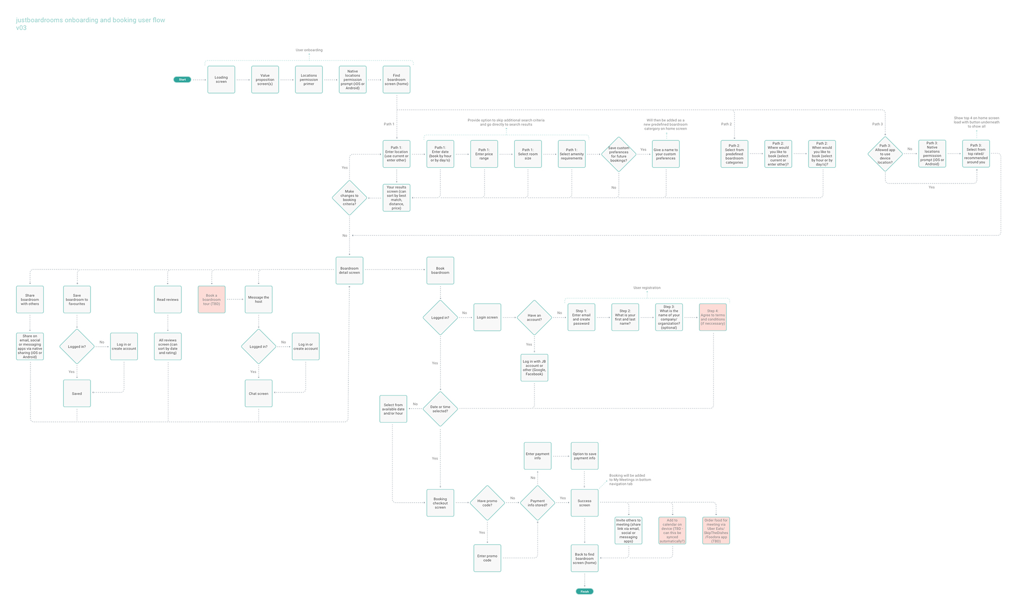
I used the User Flow as a blueprint to develop the wireframes, and then a prototype of the app, which I presented to the stakeholders.
Just Boardrooms Prototype Demo (7m 45s)
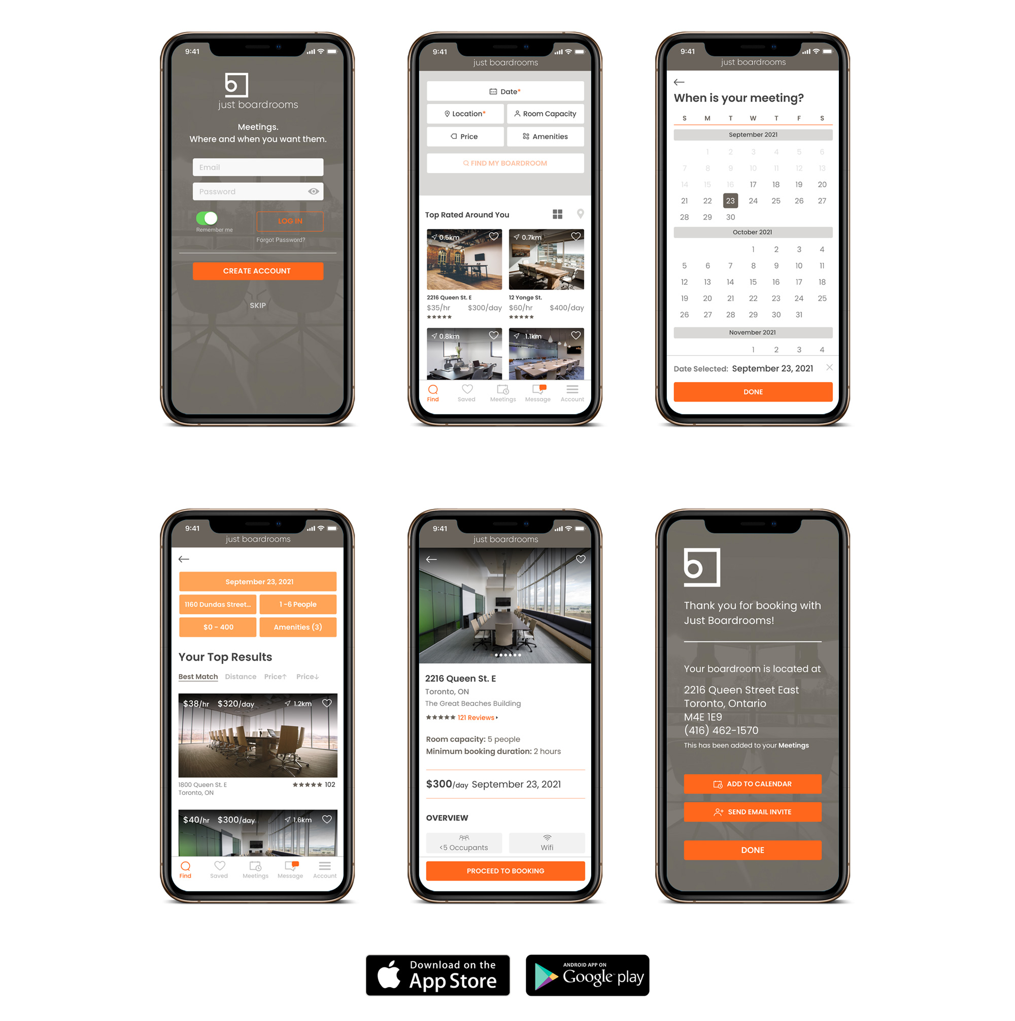
I worked with iOS and Android developers to craft the final launch product. Just Boardrooms is available for download in both the Apple and Google App Stores.
Just Boardrooms App User Interface Screens
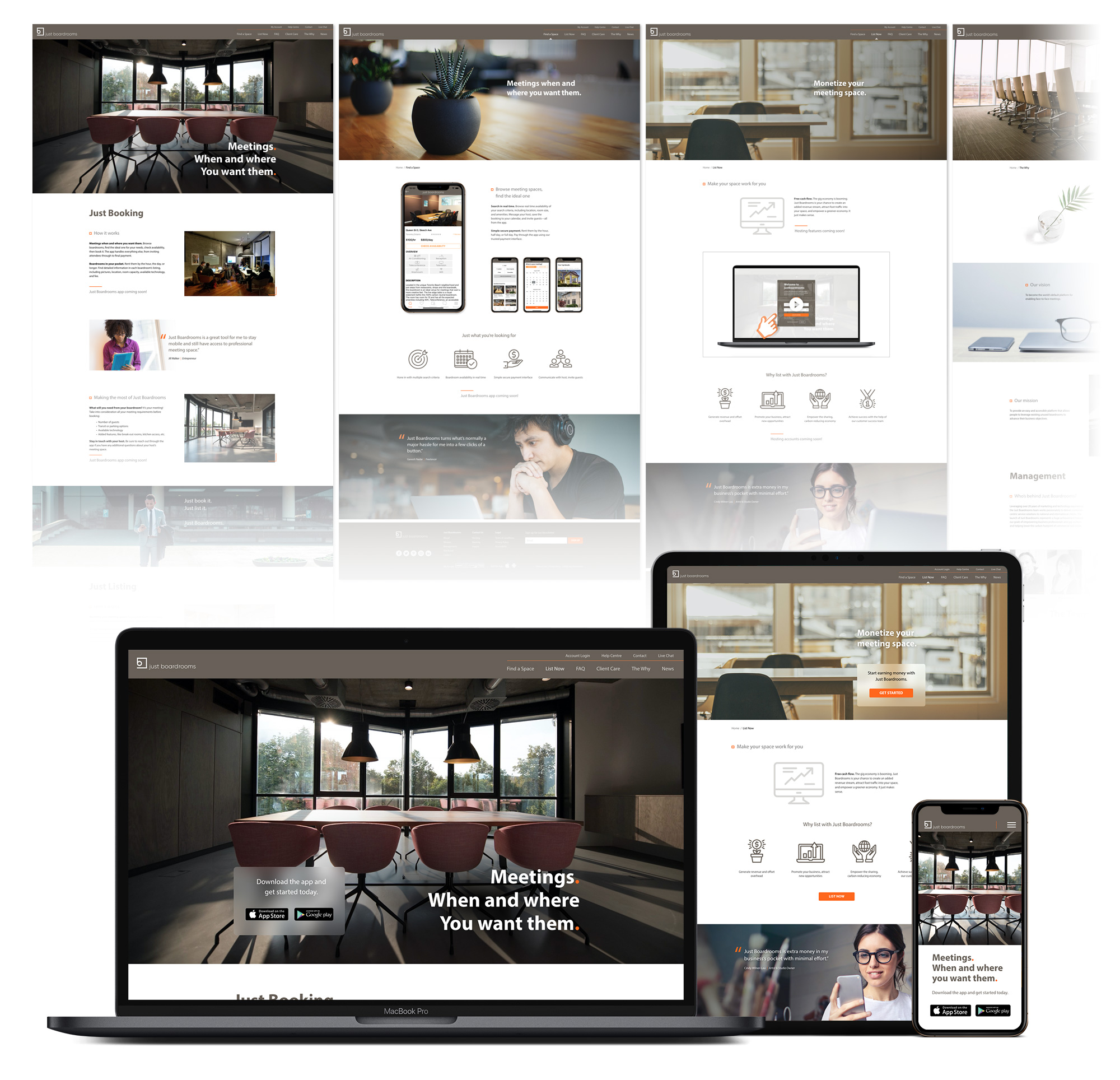
I designed the responsive JustBoardrooms.com website and worked with web developers to launch the branding site.
JustBroadrooms.com Responsive Branding Website
I was also tasked to create an artistic style and storyboard for the Just Boardrooms promotional video. I chose a whiteboard-type illustration style since marker drawings are representative of meetings and the brainstorming process.
Just Boardrooms Promotional Video – For Hosts
Product Design: maneframe App
Art direction, UX/UI design, prototyping for The Turn Lab; client: maneframe
The clients were beauty product executives who wanted to develop a social media platform for mobile that catered to hair styling professionals. Thus, maneframe would be a SaaS application that allows hairstylists and workers in the hairstyling industry to network, share their works and expand their clientele.
The challenge was that with so many other social networking apps already in use, maneframe needed standout features and functionalities to attract users to the platform. The maneframe content would need to be curated specifically for the hair care professional, thus allowing them to stay atop of trends and news. Users should also be able to easily create visual portfolios of their works to share with peers, potential clients and to submit to award shows. The goal for this product is to strengthen the hairstyling community, allowing users to network beyond their geographic location, and to share ideas and insights on the industry, and ultimately for them to grow their business.
After receiving user profile data from the clients, I devised a User Flow to map out the Customer Journey.
maneframe Initial User Flow: Login / Account Creation
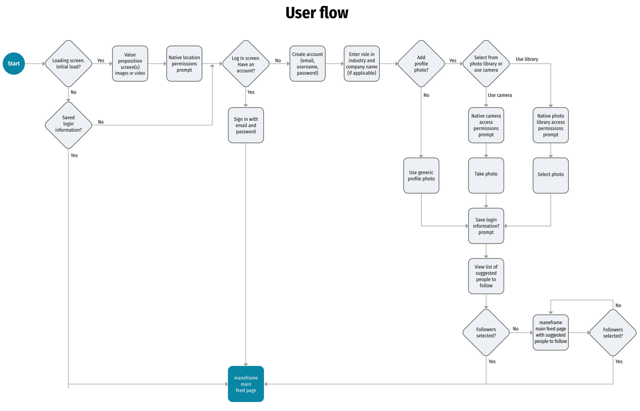
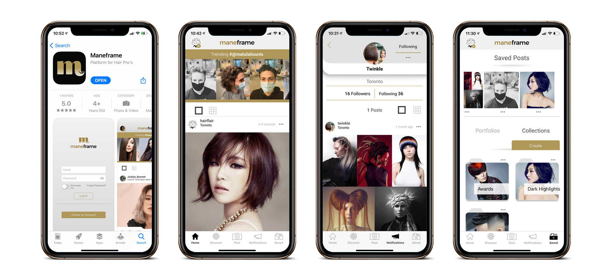
The User Flow was the foundation I used to create the wireframes for the User Experience. The User Interface was then developed to package the product.
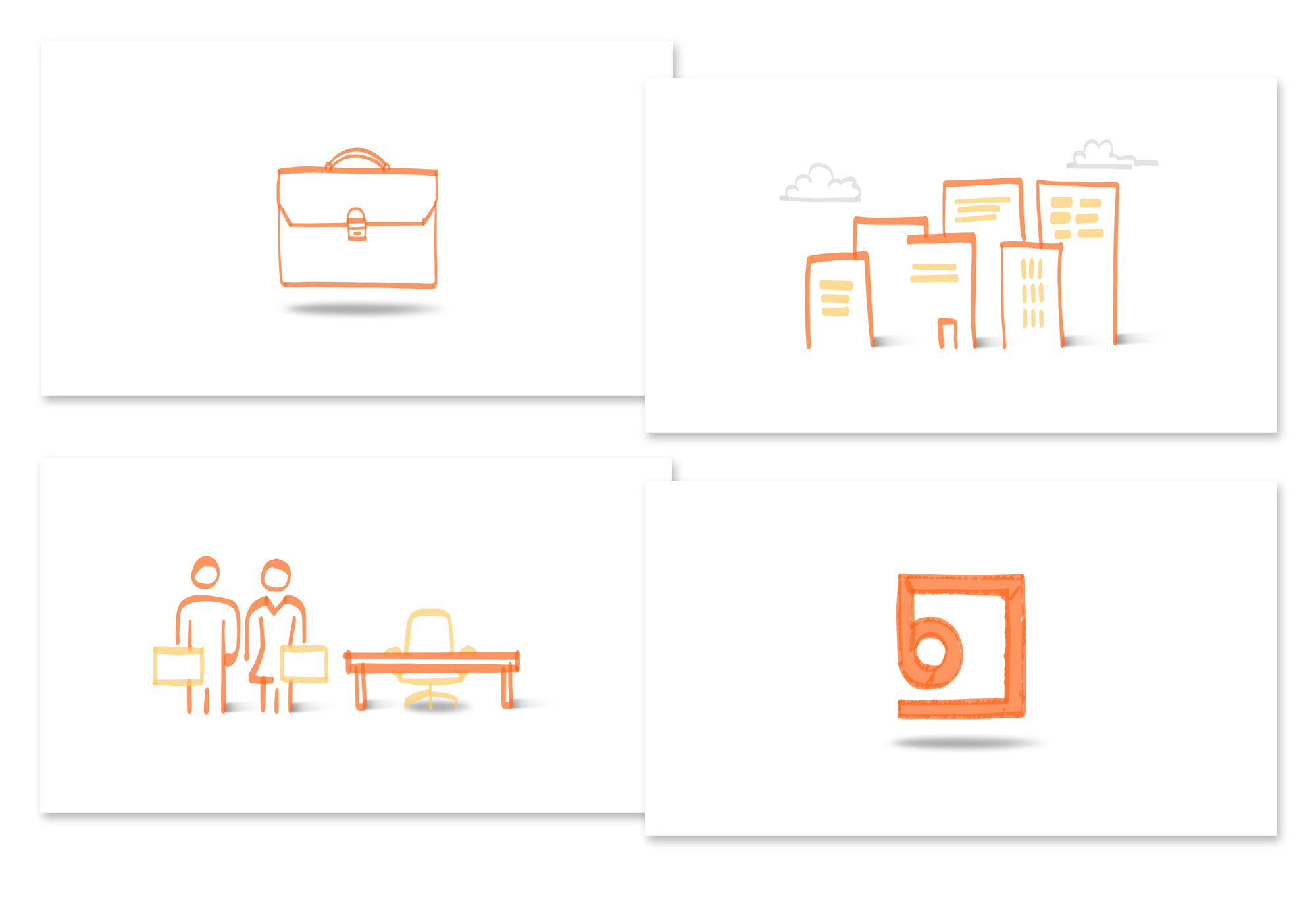
maneframe Artboards

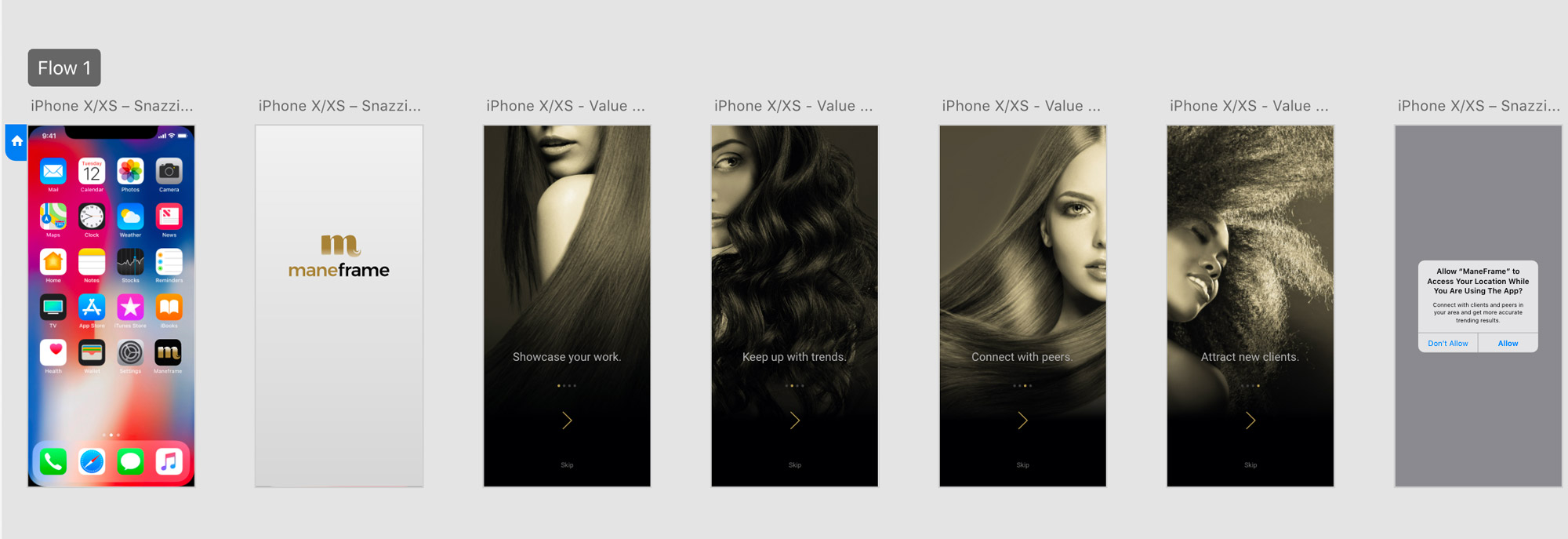
maneframe Value Loading Screens
I built the prototype to demonstrate the flow and functionality of the app. I presented the following to the clients:
maneframe Prototype Client Demo (7m 43s)
I worked with iOS and Android developers to develop the launch product. This app is currently in soft launch and can be downloaded in the iOS App Store.
maneframe Soft Launch – available in the iOS App Store
I was also asked to design a logo for the product. I decided on a bold “m” for the thick and thin curves of the character represented the flow and elegance of hair.
maneframe Logo and App Logo Design

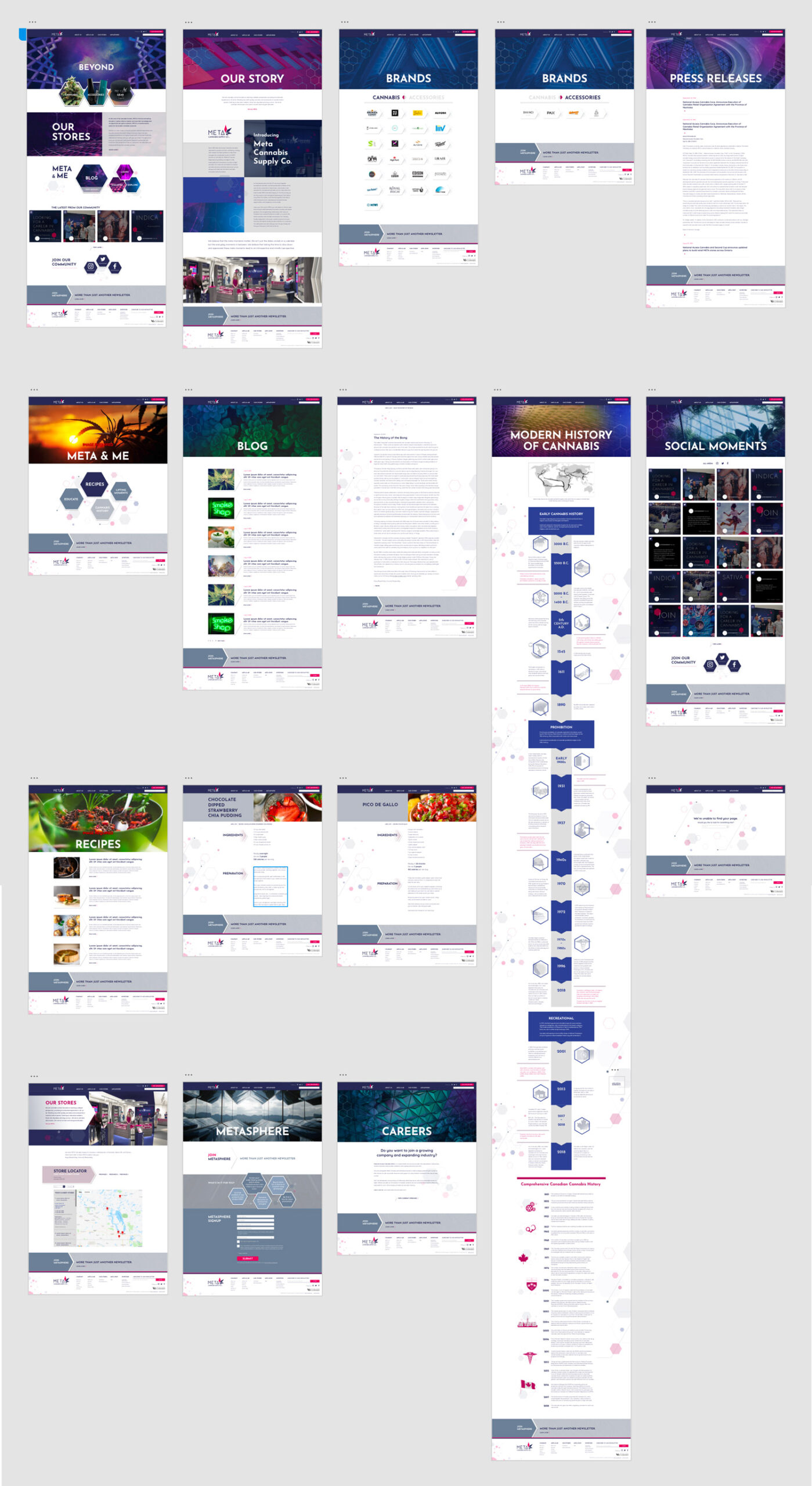
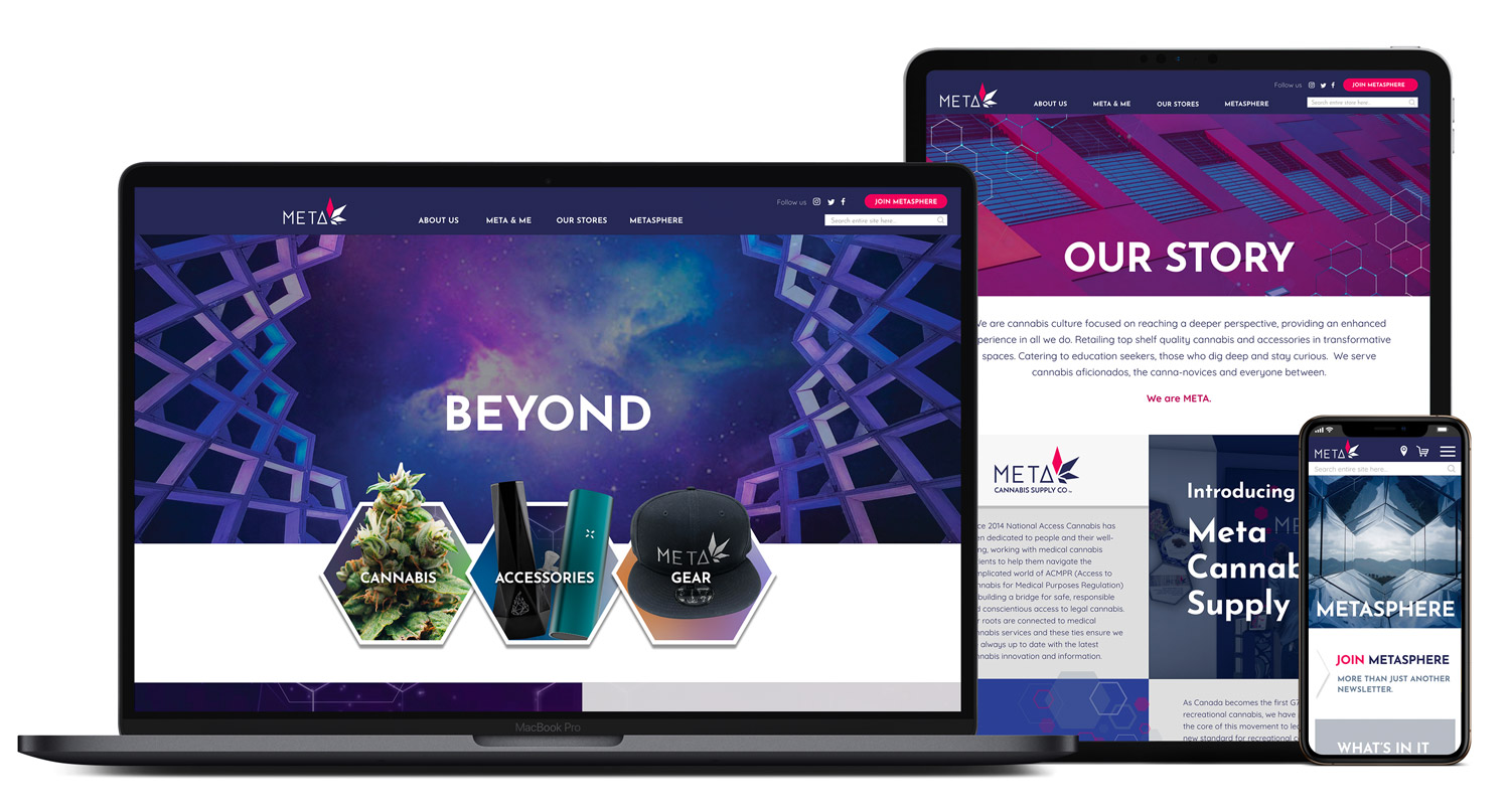
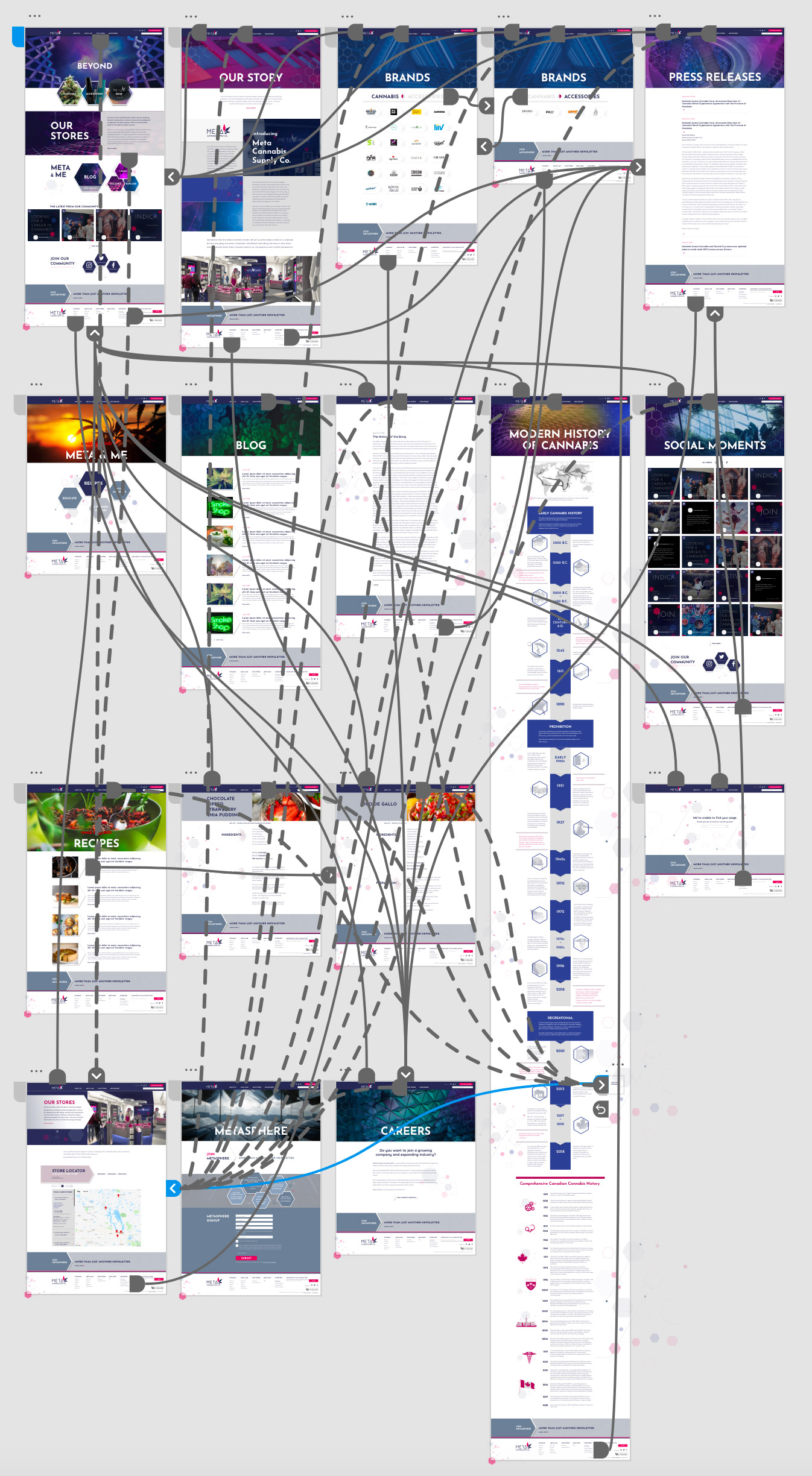
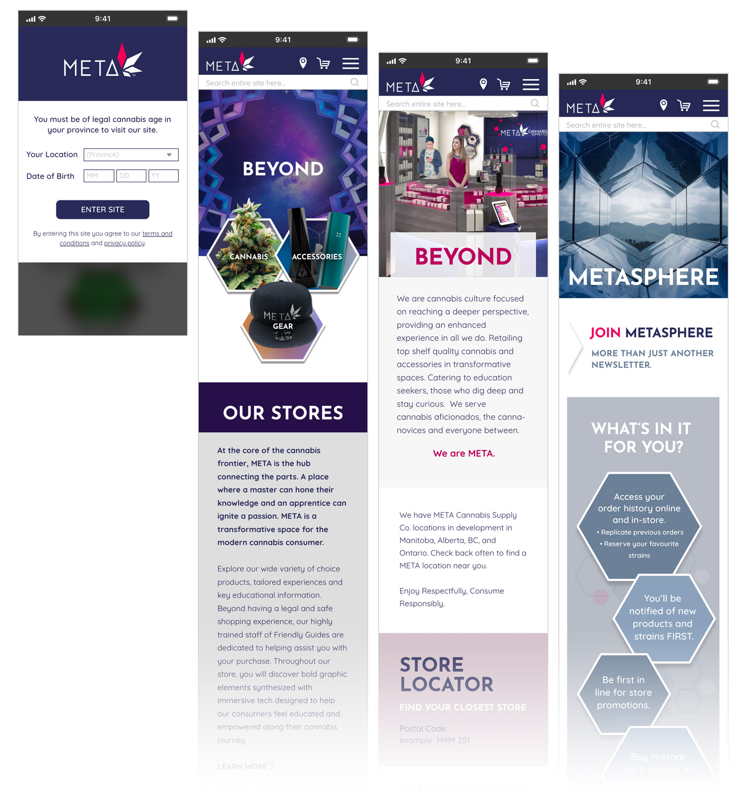
Responsive Website Design for Meta Cannabis
Art direction, UX/UI design, prototyping for The Turn Lab; client: National Access Cannabis
National Access Cannabis (NAC) required a responsive website for their retail division, Meta Cannabis. The challenge they proposed was to develop an interface that suited their brand that also had to absolutely comply with the strict, constantly changing government regulations regarding the marketing of retail marijuana. Weeks of research and study resulted in the MetaCannabis.com site, which was launched with great client satisfaction, within regulations, and on time to take advantage of the launch of legalized marijuana.
Information Architecture
Mobile Interface
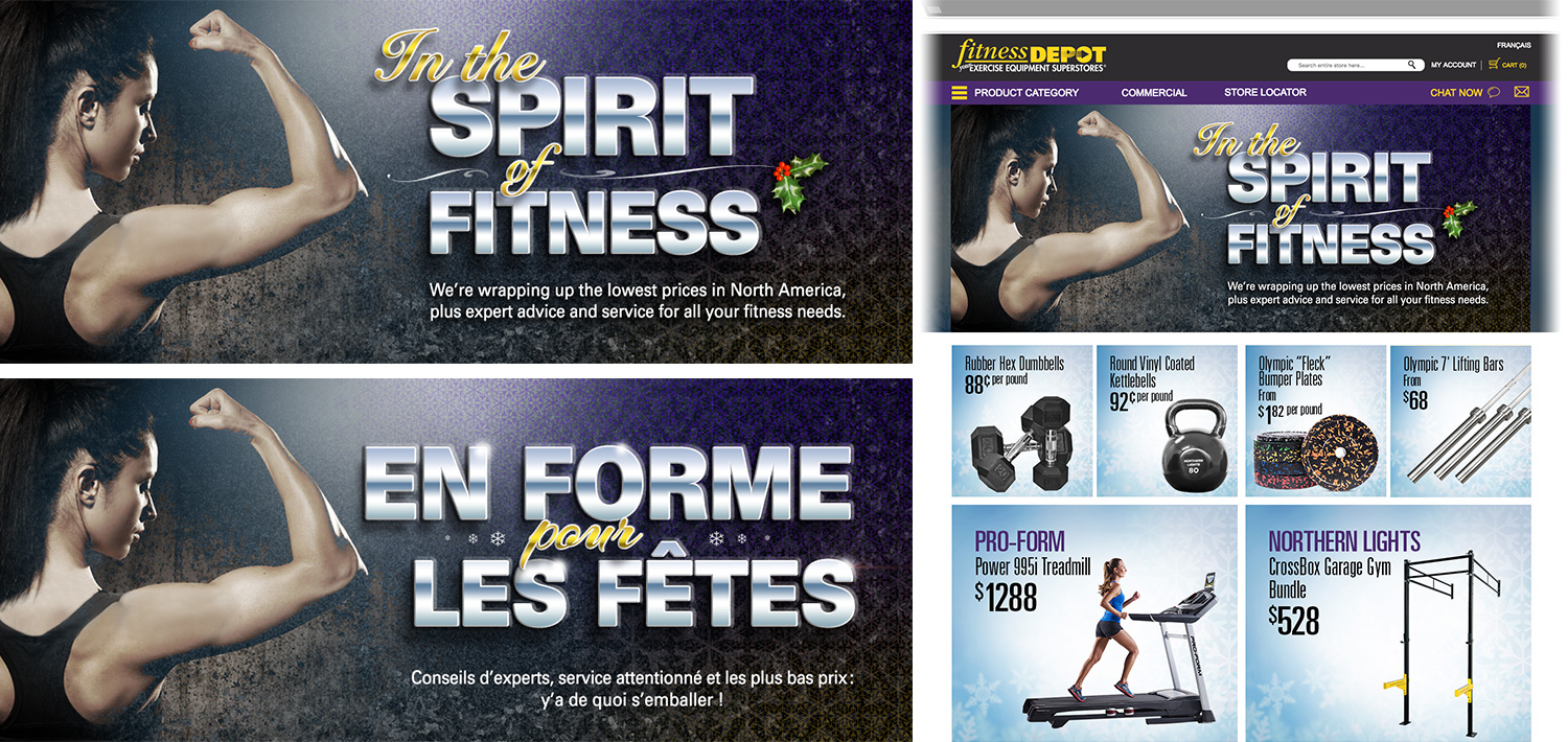
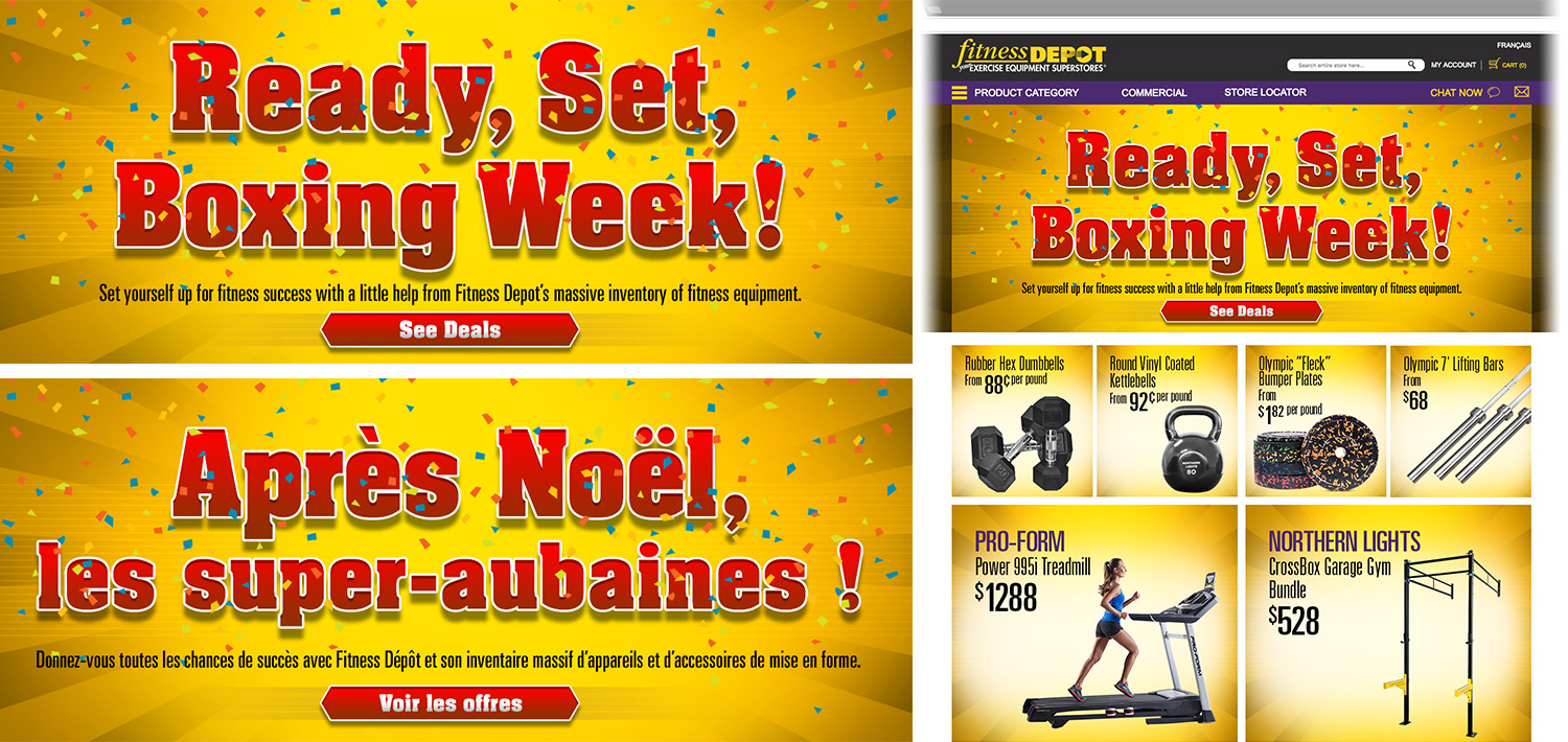
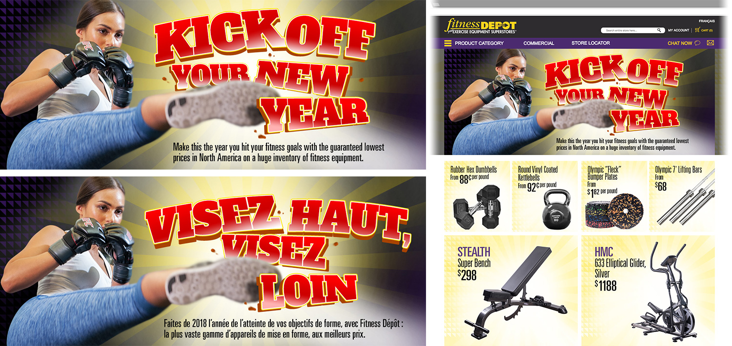
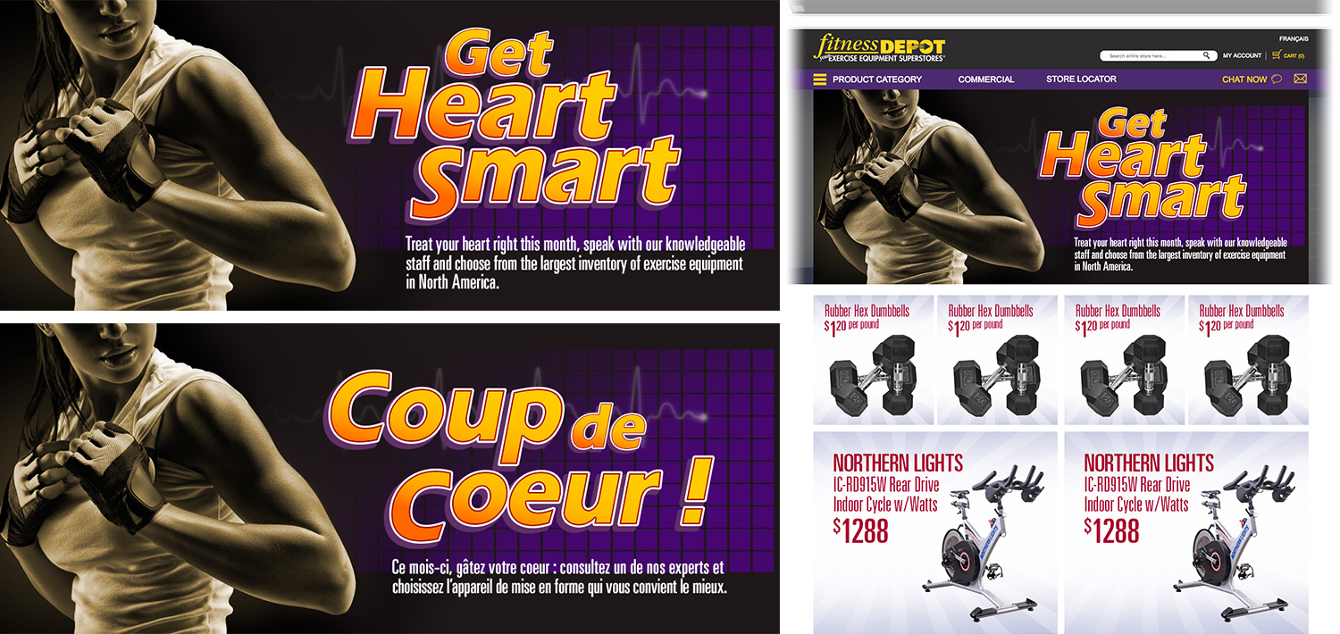
Fitness Depot Winter Online Campaigns
Art direction, digital design for Fitness Depot’s winter online campaigns.
Fitness Depot, one of North America’s largest exercise equipment retailers, required inspiring, energetic campaigns over the winter months to motivate consumers to achieve their fitness goals. The following creatives were devised in both English and French, for Fitness Depot’s e-commerce site in Canada and the U.S.
Holiday Campaign
Boxing Week Campaign
New Year’s Campaign
February Heart Month Campaign
Happy Holidays!
A video greeting card for family and friends.
Henry’s “1 Shot 3 Ways” Social Media Video Tutorials
Art direction, script writing and storyboards for Henry’s social media video tutorials.
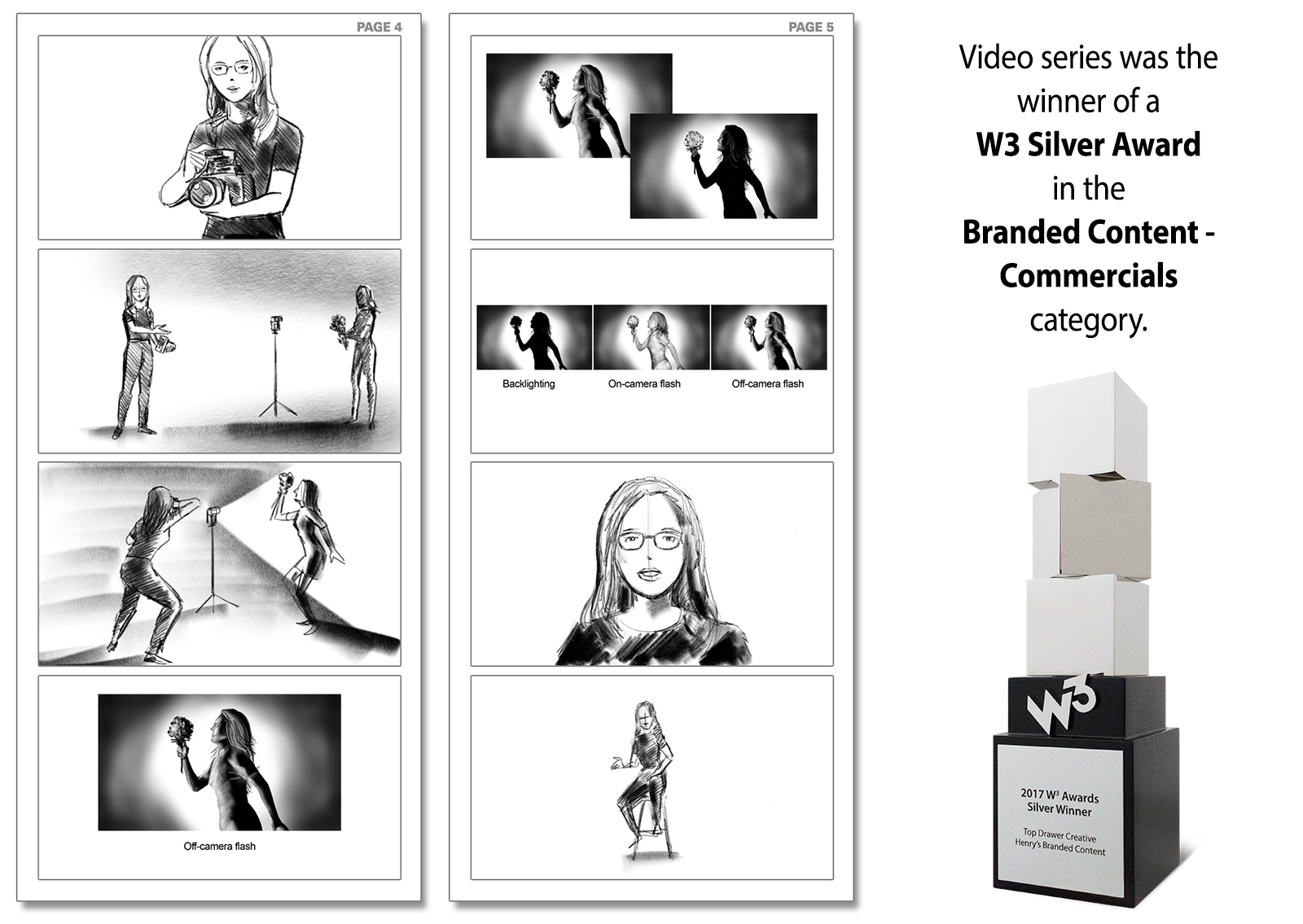
Henry’s Camera’s online strategy included the creation of video tutorials that can be shared through social media. I was selected as the creative lead for this project for my knowledge of photography and my ability to visualize and simplify complex technical concepts. I devised the structure for the tutorials, wrote the scripts and created the storyboards for a series of Henry’s “1 Shot 3 Ways” videos. This set of tutorials helped Henry’s win a W3 Silver Award in Branded Content – Commercials category.
The following are the storyboards for the “1 Shot 3 Ways” lighting tutorial featuring photographer Lori Waltenbury.
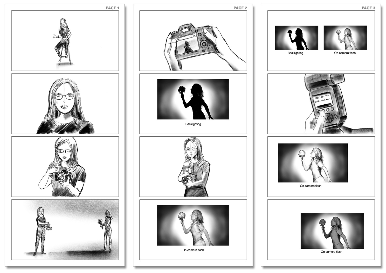
The finished social media video tutorial:
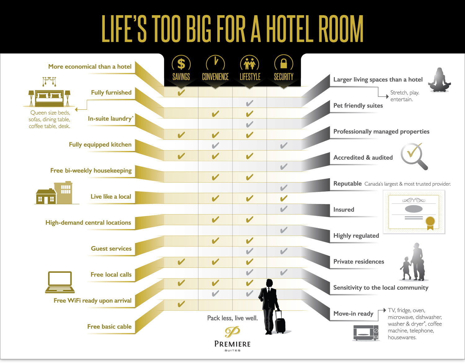
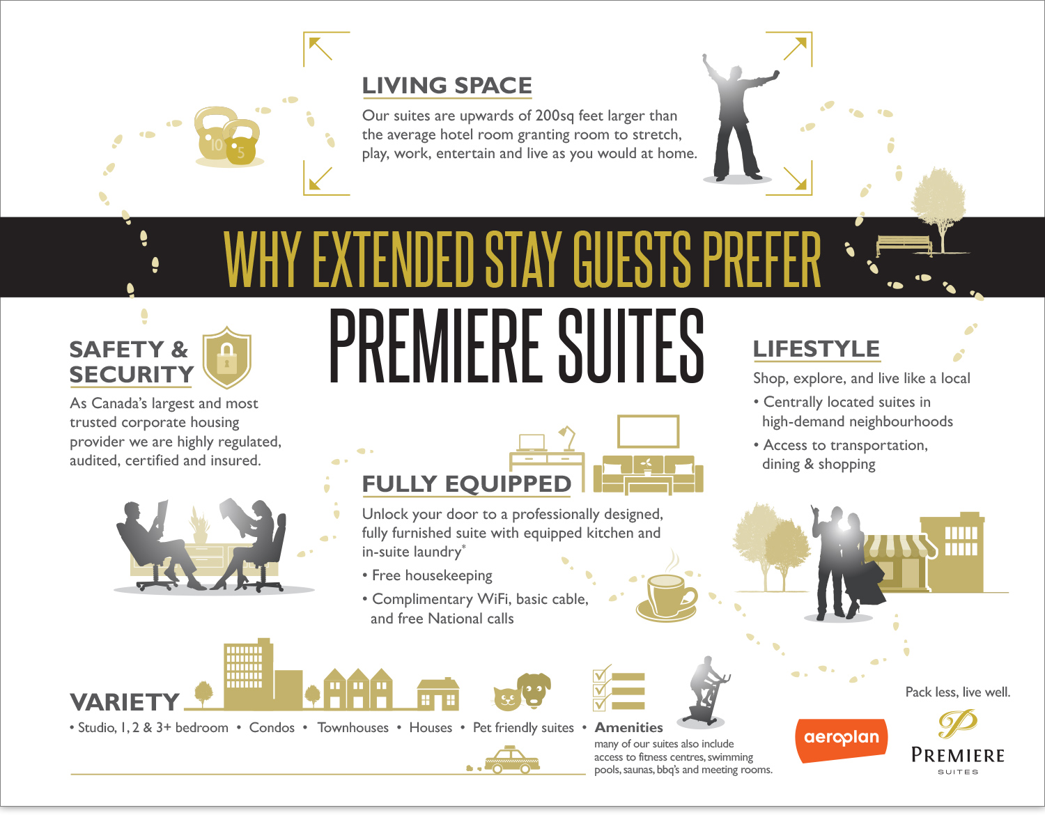
Premiere Suites Infographics
Art direction, graphic design for Premiere Suites infographics.
Premiere Suites, Canada’s largest corporate housing provider, needed information to be presented in a creative, visually-appealing manner that reflected the lifestyle aspect of their business. The following infographics organized their data into simple, logical formats that is both professional and playful.
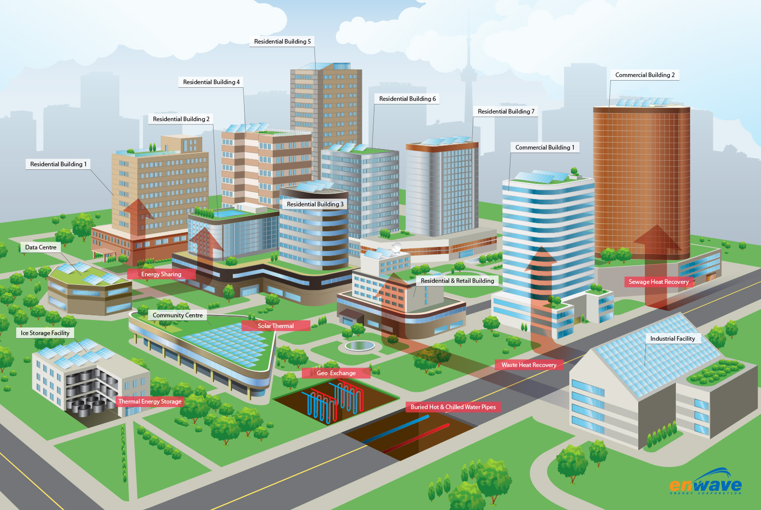
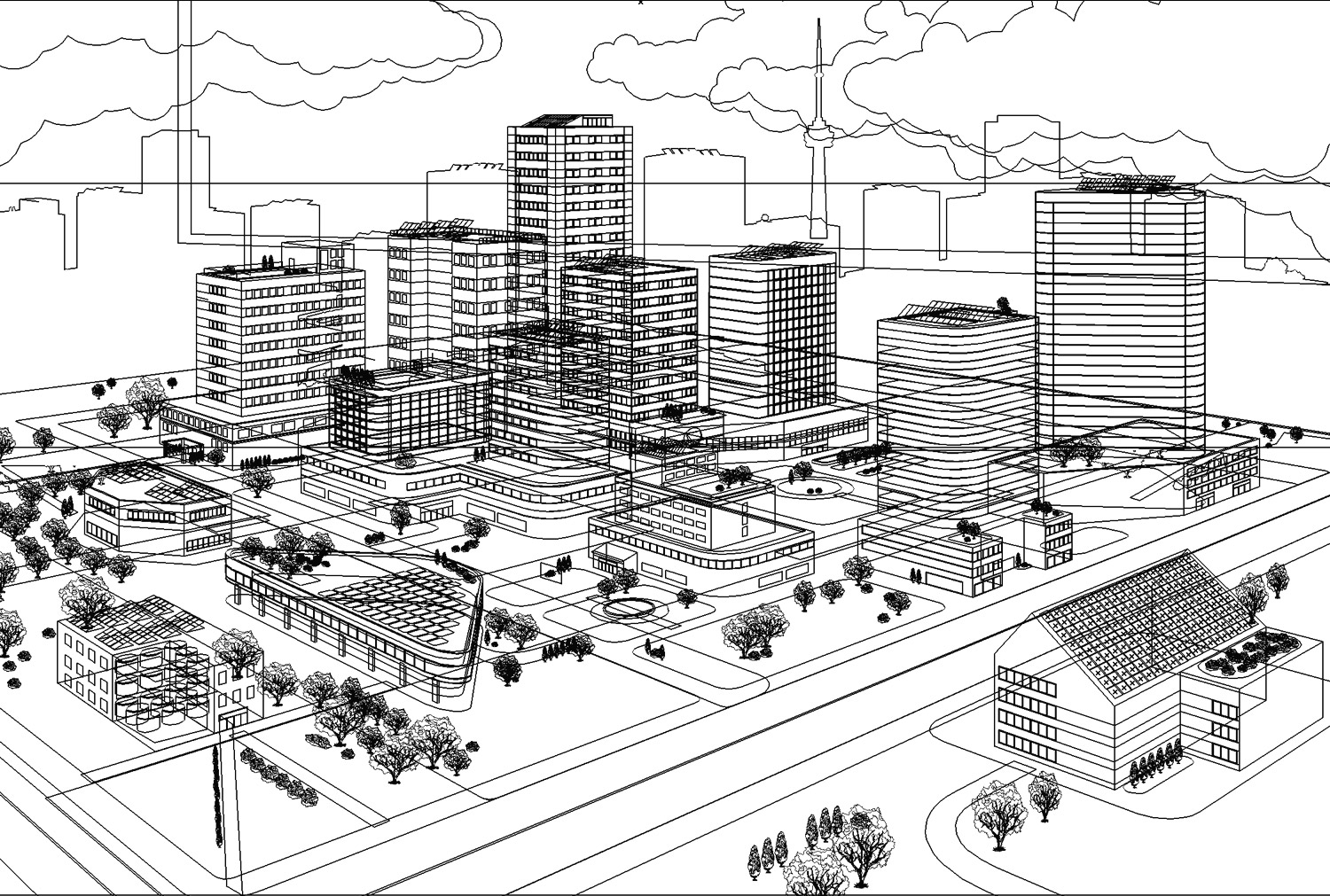
Enwave Energy Corporation Urban Utopia Illustration
Art direction, digital illustration for Enwave’s Utopia Energy System graphic.
Enwave Energy Corporation, one of North America’s largest energy district systems, channels cold water from Lake Ontario to cool office buildings in Toronto. They required a clean, vibrant graphic to showcase their distribution of thermal energy in a simplified, friendly style.
The following vector illustration depicts Enwave’s goal of an utopian near-future where urban energy needs are met in a sustainable, environmentally-conscious fashion.


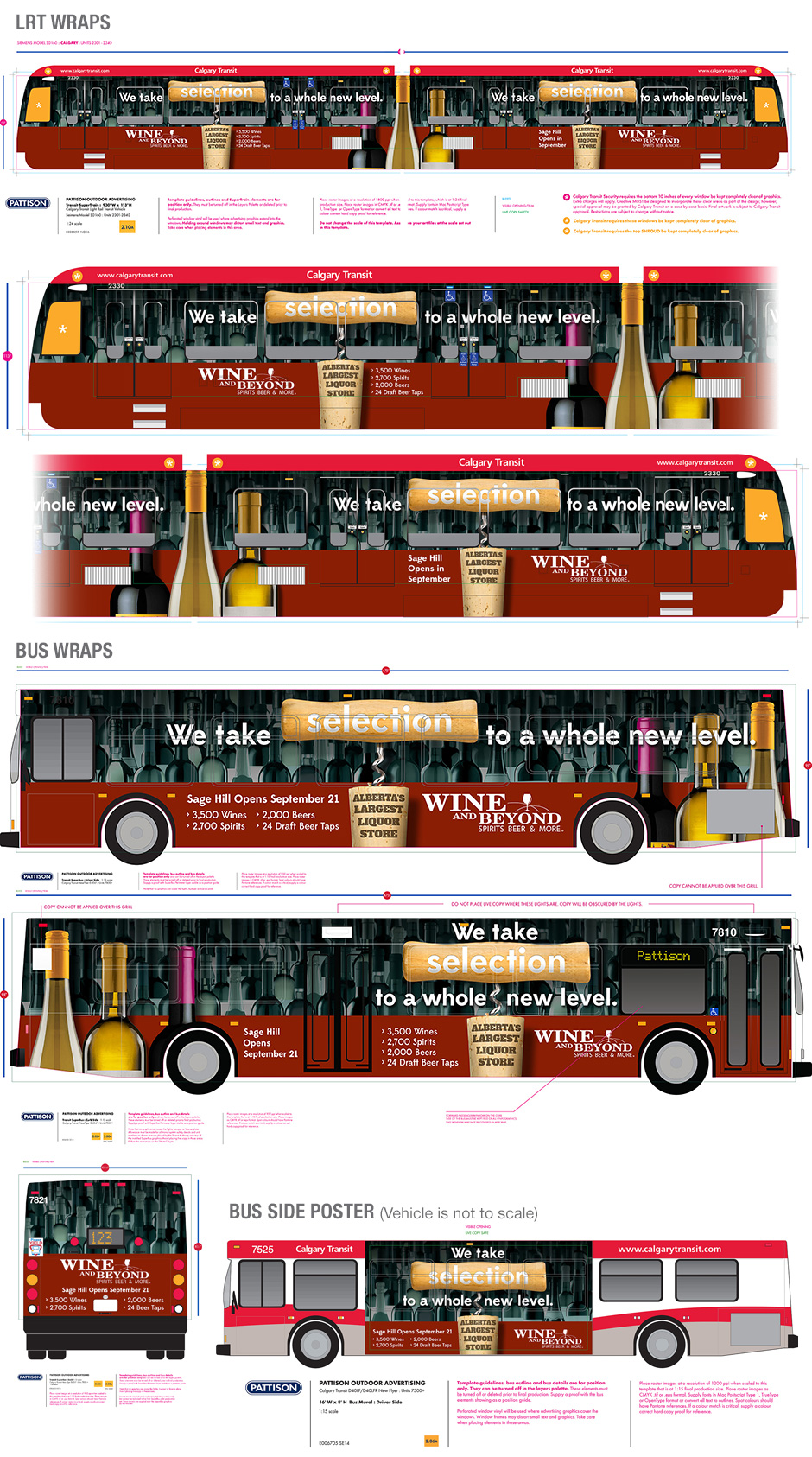
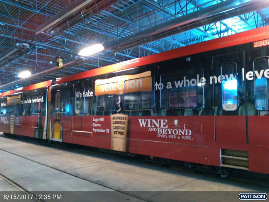
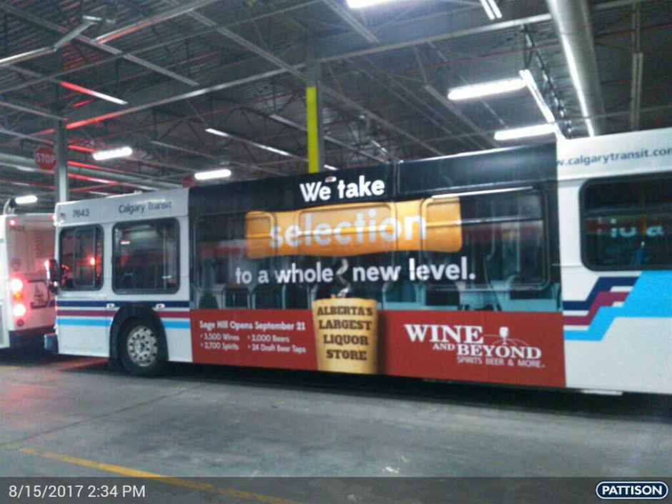
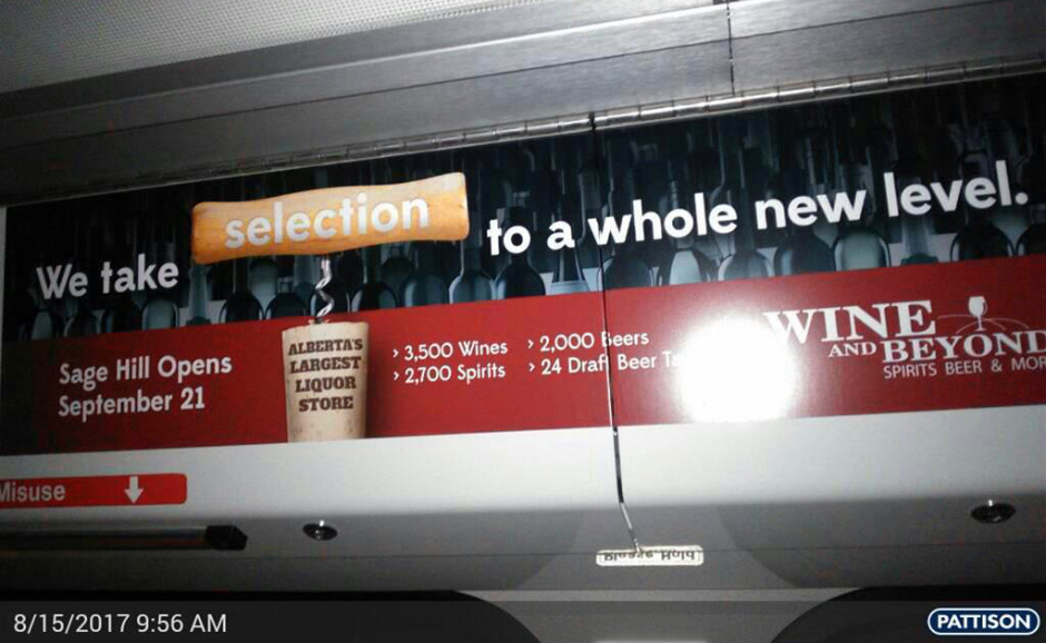
Transit Posters and Vehicle Wraps for Liquor Stores North America (LSNA)
Art direction, graphic design and pre-press for transit posters and light rail train and bus wraps.
LSNA is North America’s largest publicly traded liquor specialty retailer. When LSNA’s Wine & Beyond branch opened the largest alcohol retail store in Alberta, they needed a bright and bold campaign to proclaim their industry-leading wine selection. The following designs focus on variety and selection and deliver the message in a clear, eye-catching style that stand out on city streets.
Television Branding Commercials for Liquor Stores North America (LSNA)
Art direction, storyboards, illustrations, and customization of stock illustrations for a series of LSNA TV branding commercials.
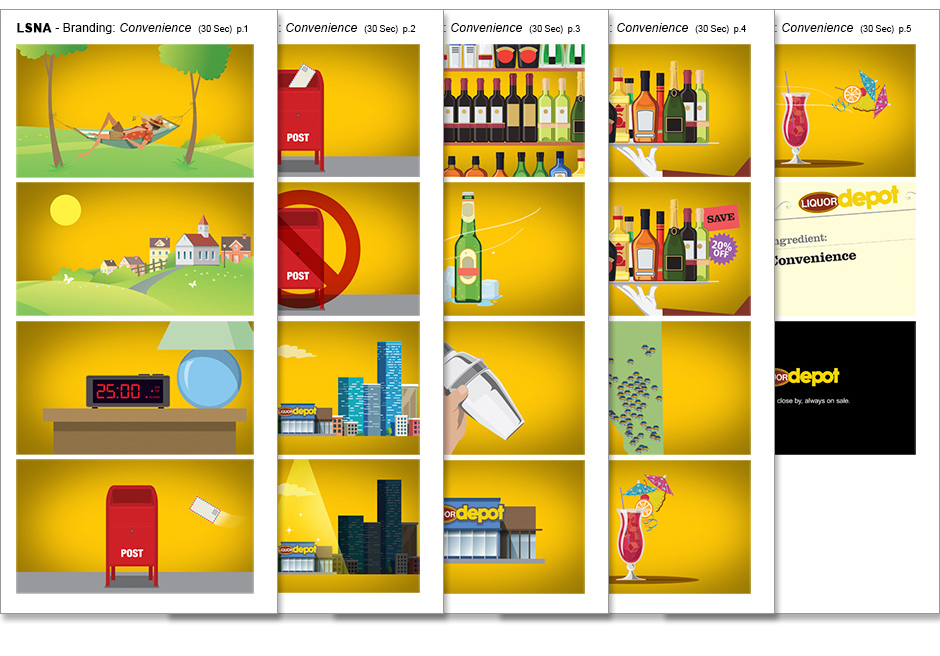
LSNA’s Liquor Depot branch wanted to inform Alberta residences of the great services its stores had to offer. Three humorous and lively 30-second television spots were created to brand Liquor Depot on “Price”, “Convenience” and “Delivery”. The following commercial is “Convenience”.
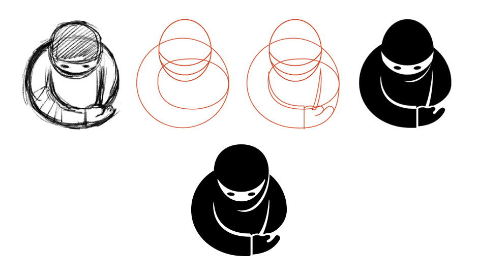
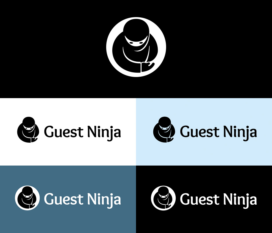
Guest Ninja Logo
Art direction, graphic design for Guest Ninja logo.
Guest Ninja is Premiere Suites’ customized CRM software tool designed specifically for the hospitality sector to handle properties, guest services, leads, sales tracking, analytics, and communications. The logo has to be fun, approachable, animated and one-colour, and must be able to sit cleanly on the top left corner of a computer screen. It will also be used on various promotional items.

The logo depicts a cartoon ninja in a bowing, welcoming stance, ready to greet a guest. The shapes are large and black to show strength and professionalism, yet soft with gentle curves to convey approachability and friendliness. The logo is simple with a unique shape that is easily recognizable, and works well in all sizes.
Holiday Greeting
A digitally-painted holiday greeting image for family and friends.
Toronto Public Health Pedestrian Safety Video
Art direction, storyboards, and illustrations for Toronto Public Health’s Pedestrian Safety Basics video.
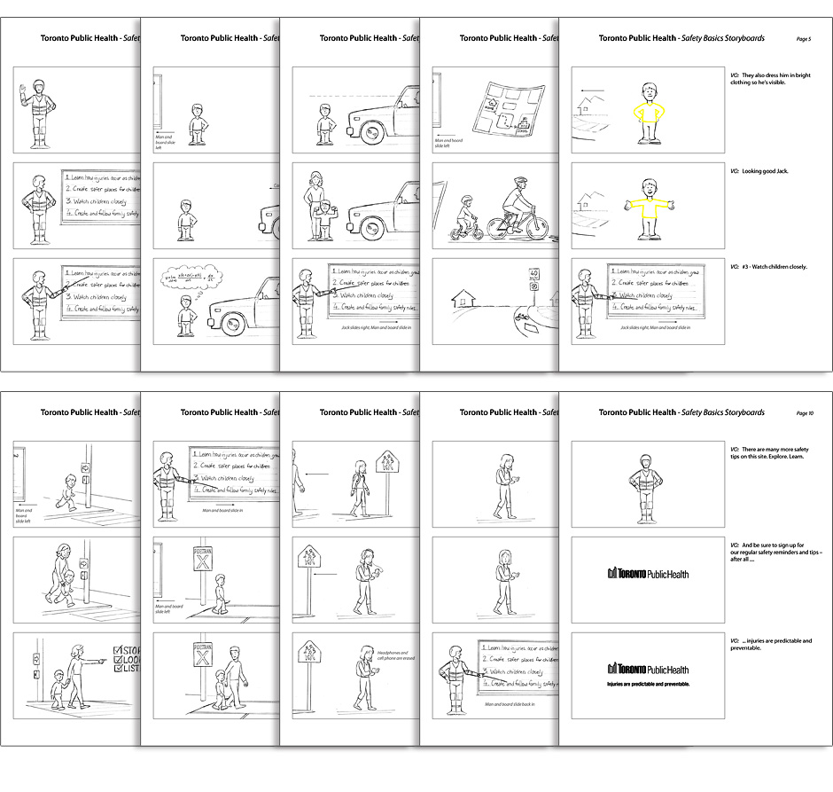
To combat the troubling rise in pedestrian injuries and fatalities with motorists, the City of Toronto needed a method to communicate safety basics to parents and children. This animation was created to delivery a serious message in a fun, entertaining manner that both adults and kids can enjoy. The video was shown in community centres, schools, and movie theatres, and was met with very positive praise from teachers, parents and children.
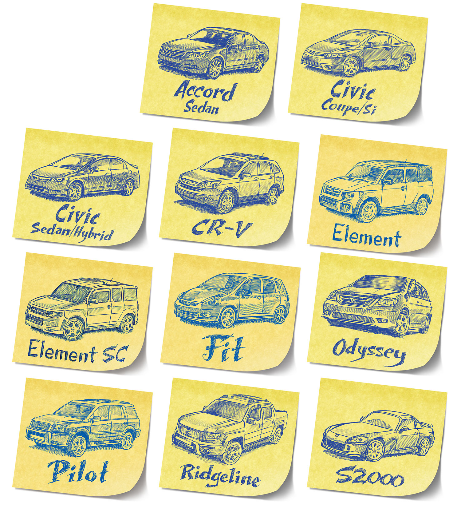
Honda Brochure Design Elements
Art direction, illustrations, photo retouching for Top Drawer Creative; client: Honda Canada.
Honda Canada wanted bright, whimsical design elements in their brochures that made their cars feel more relevant to the everyday lives of drivers. These doodle stickies were developed to create a personal and creative touch to the Honda cars.